

") Browns
Browns ") Blues
Blues  All Colours
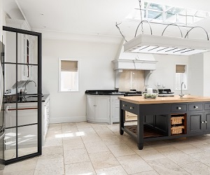

Paint Forecasting 2026: Styles, Trends & Where We're Seeing Colour Make an Impact
The Big Shift: No More Following Trends (Unless You Actually Love Them)
There aren't really "trends" anymore in the traditional sense. What we're seeing instead is something far more interesting – people choosing colours and design elements that genuinely resonate with them, creating spaces that feel personal, warm, and lived-in.
After years of perfectly styled, Instagram-ready interiors, homeowners are craving warmth, personality, and character. James McNamara from JMC Studios puts it perfectly: "Choose what you genuinely love. Don't worry about whether it's 'on trend' or 'impractical' – it's paint, you can always repaint. If a colour makes you a little nervous, that's usually a good sign."
The most beautiful homes we've worked on are the ones where clients took a risk and went with colours that spoke to them, not colours they thought they "should" use.
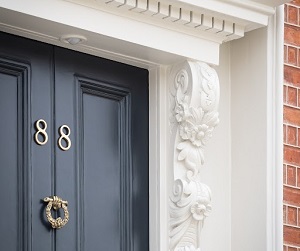
Colour Trimming: The Technique That's Quietly Transforming Irish Homes
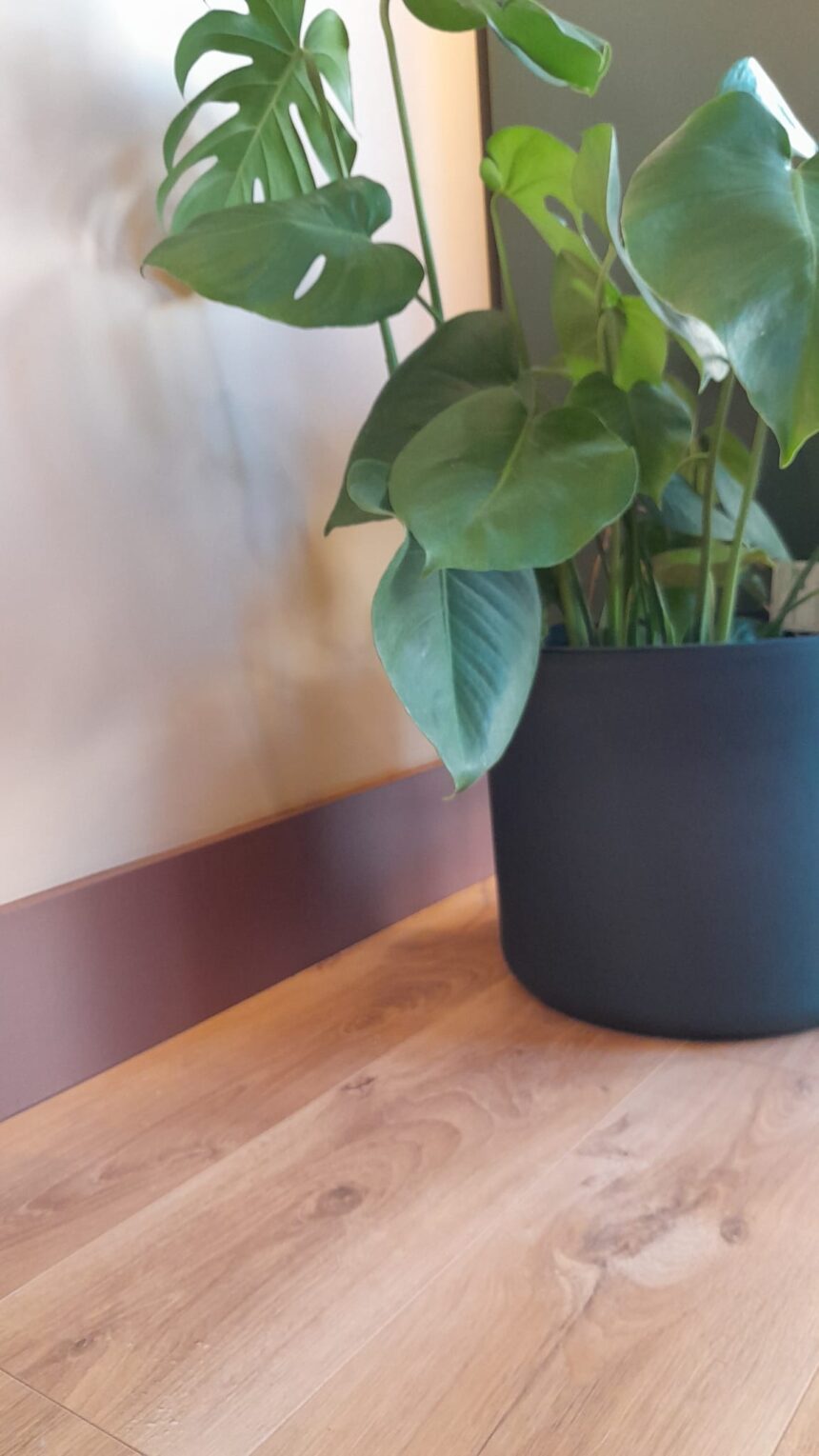
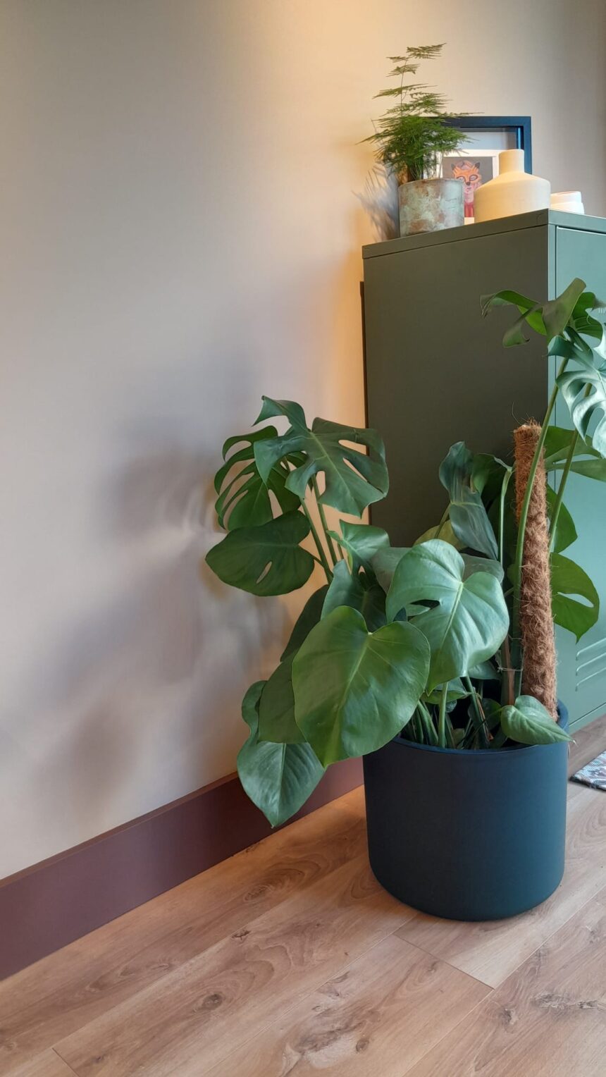
One of the most effective techniques we're seeing is what Tammy Lane from Lane Interiors calls "colour trimming" – using a darker or complementary shade on your skirtings, architraves, or furniture to bring visual interest and warmth.
Tammy explains: "This is a really beautiful way of grounding a space with earthy colours to bring in a feeling of nature. I recently used this in my own studio and it has transformed it into a warm but inspiring space."
The beauty of this technique is its versatility:
- On skirtings: Paint them in a deeper shade from your wall colour family for a grounded, cohesive look
- On furniture: Sand a piece, restore the natural wood, then paint the legs in a darker/lighter tone of your wall colour
- On architectural details: Highlight alcoves or arches with a slightly different shade to draw attention to beautiful features.
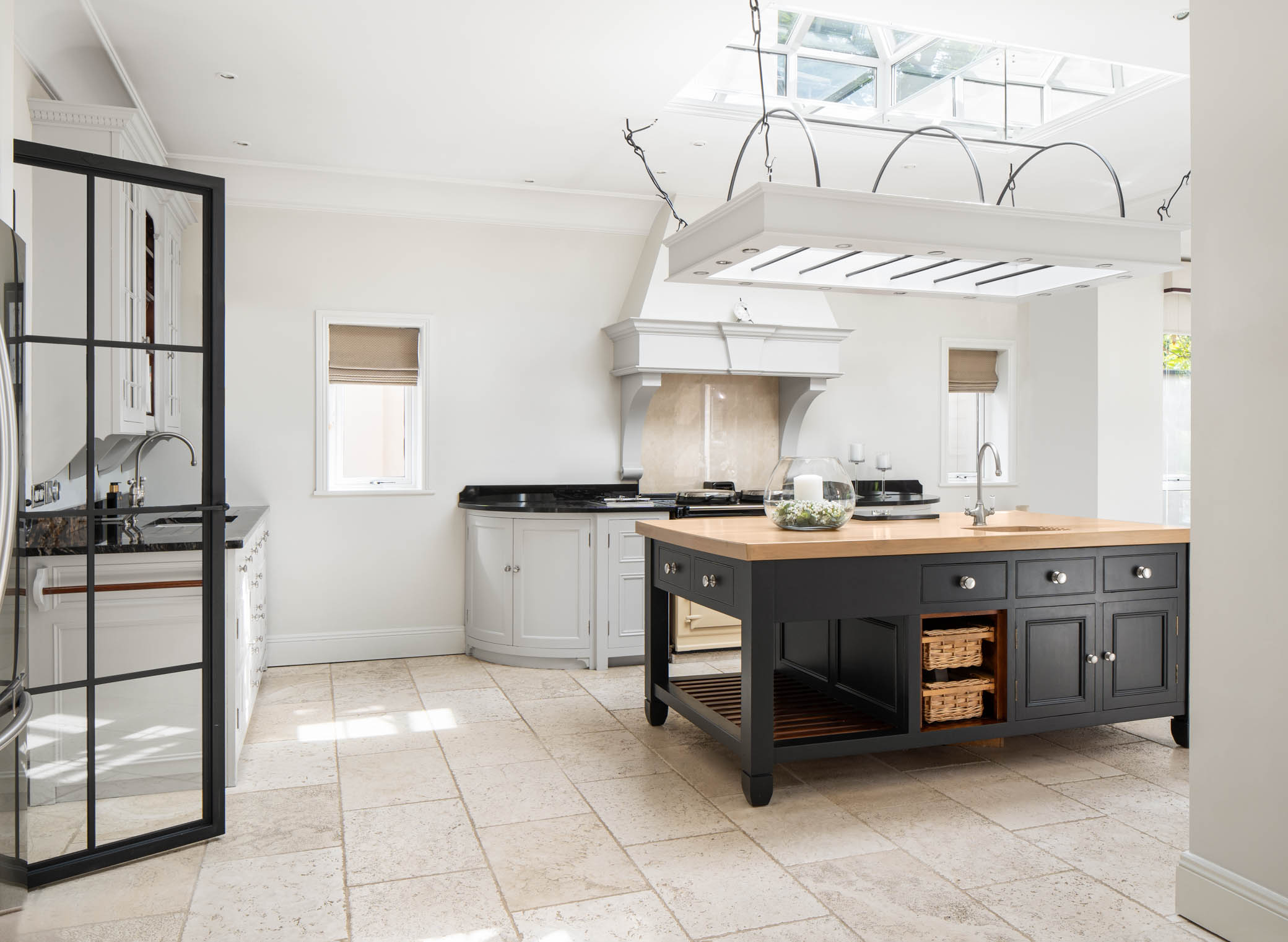
We're seeing clients experiment with this approach particularly with our warm neutrals. Paired with slightly deeper trim, these create spaces that feel inviting and perfectly suited to Irish homes.
Dirty Neutrals: The Sophisticated New Neutral Palette
If you've noticed a shift away from cool greys and stark whites, you're right. Enter: dirty neutrals – complex, layered colours that sit somewhere between beige, taupe, and grey, shifting beautifully throughout the day as light changes.
What makes them special is their complexity. They're part grey, part brown, with undertones that might hint at olive, blush, or clay. These colours feel human – slightly imperfect, infinitely adaptable, and effortlessly sophisticated.
After years of sleek minimalism, homeowners are craving authenticity. Dirty neutrals deliver exactly that.
Why They Work in Irish Homes
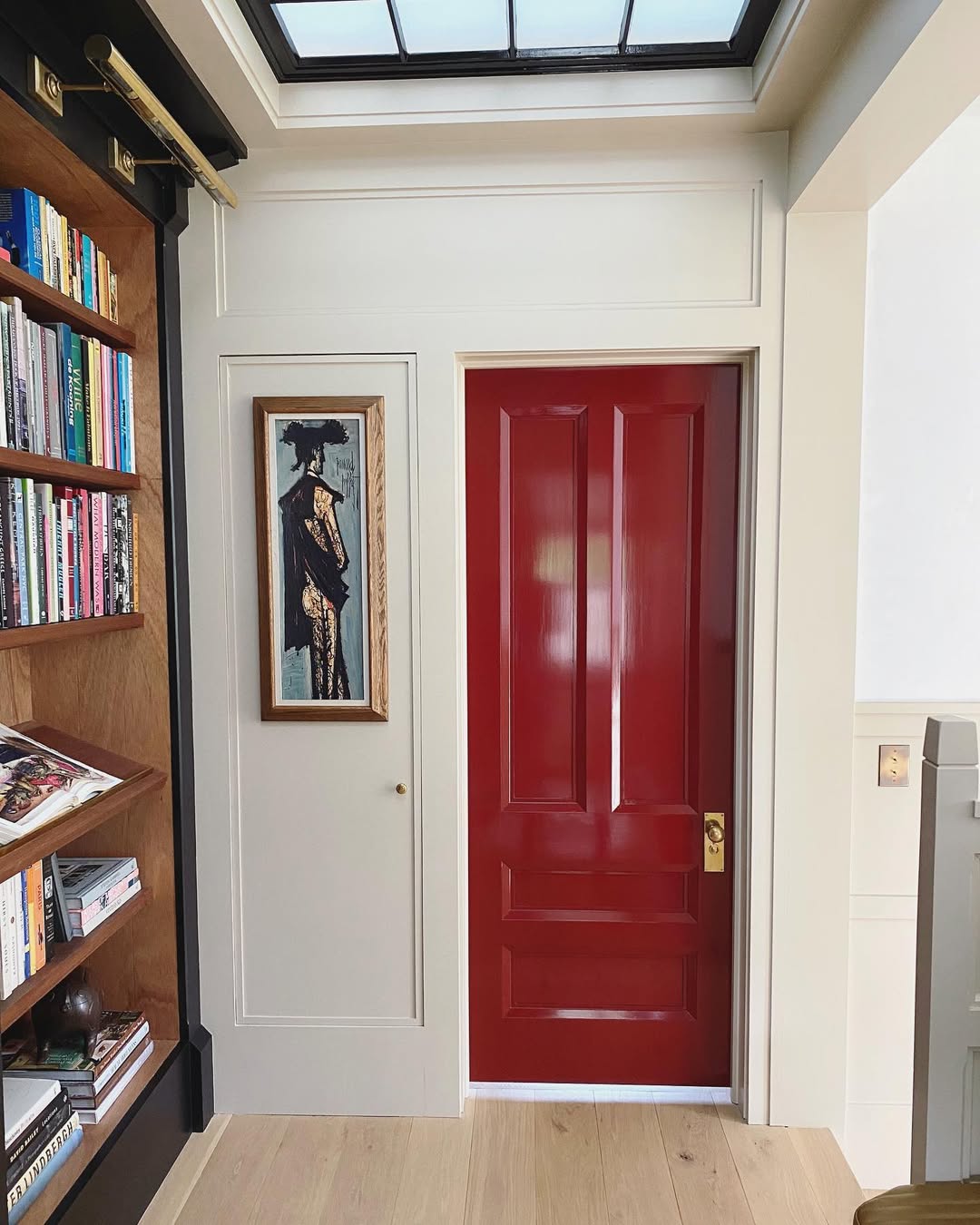
Lacquered Finishes: High-Gloss Glamour Returns
James shares: "Lacquered finishes are becoming a major moment for 2026. Lacquer works beautifully in both maximalist and minimalist spaces – it brings a playful, glossy energy that instantly elevates a room."
High-gloss finishes are making a confident comeback. The reflective surface bounces light around rooms, making spaces feel brighter and more open – particularly powerful in smaller Irish homes or rooms that don't get abundant natural light.
Where to Use High-Gloss Paint
- On ceilings: A high-gloss ceiling adds colour and drama while the reflectiveness prevents darker shades from feeling too enclosed
- In colour drenches: High-gloss throughout (walls, trim, ceiling) adds glamour without overwhelming
- On furniture and cabinetry: A lacquered sideboard or console instantly becomes a statement piece
We'd recommend using high-gloss strategically – on woodwork, doors, or as an accent. It's high-reward when used thoughtfully.
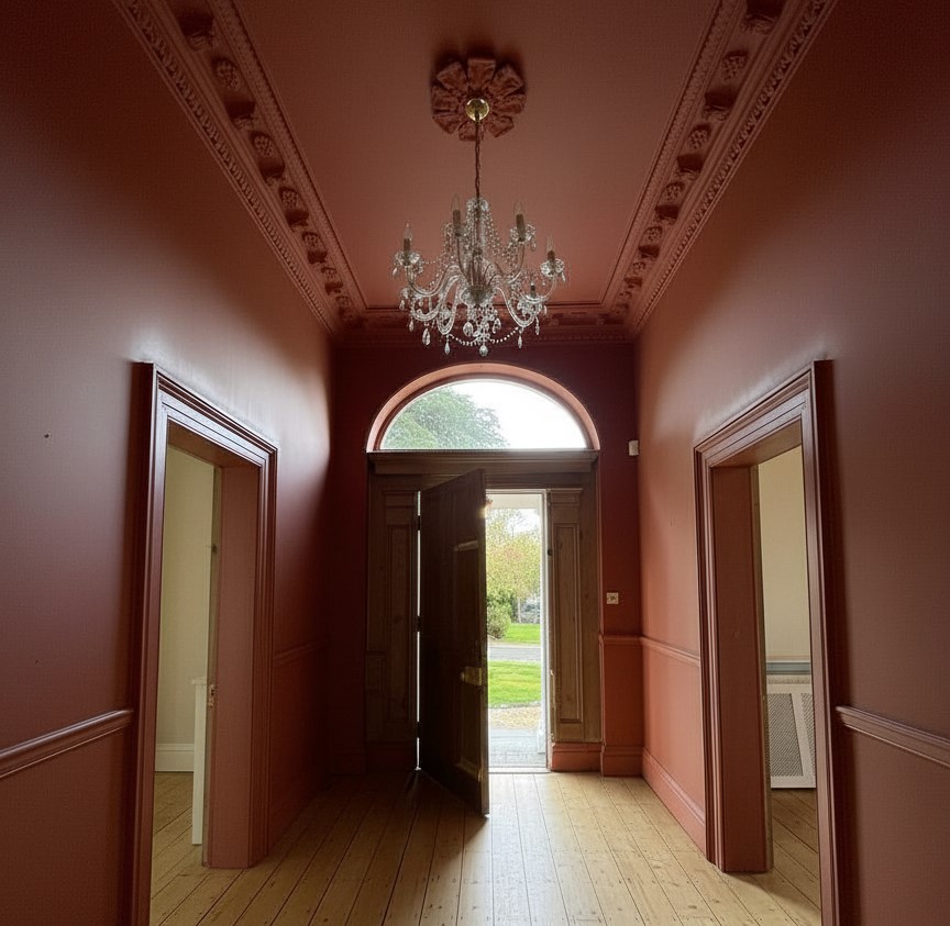
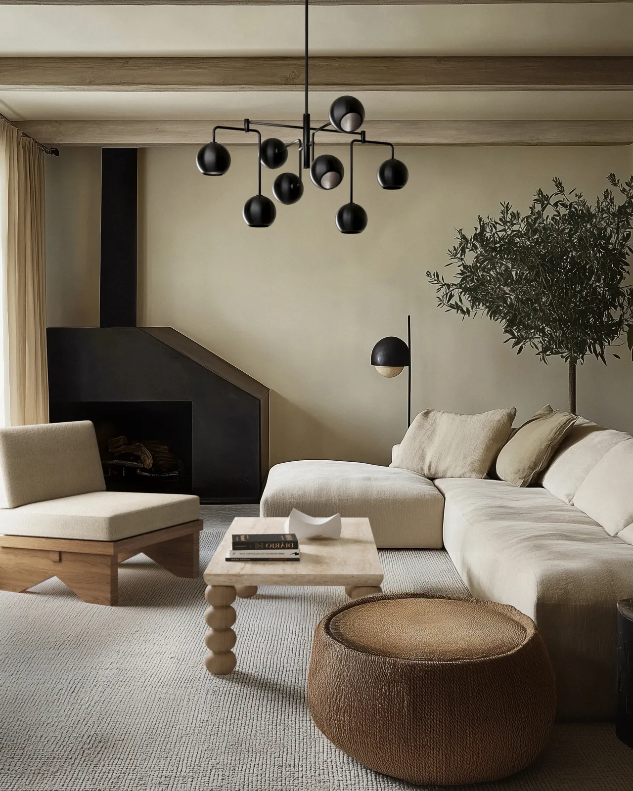
Colour Drenching: Still Going Strong
Colour drenching – coating the entire room in one colour (walls, ceilings, doors, skirtings) – continues to transform spaces beautifully. The result is a cocooning, immersive space that feels both bold and surprisingly calming.
The beauty? When everything is the same colour, architectural details become more prominent, and the space feels cohesive and considered. It's theatrical without being jarring.
Our Take on Colour Drenching
In period properties with high ceilings and ornate cornicing, drenching highlights architectural details beautifully. In modern homes, it creates intimacy and warmth – particularly effective in bedrooms or dining rooms.
The key is choosing a colour with real depth and complexity. Our Premium Collection includes deeper greens, soft pinks, and warm terracottas that all work beautifully for colour drenching

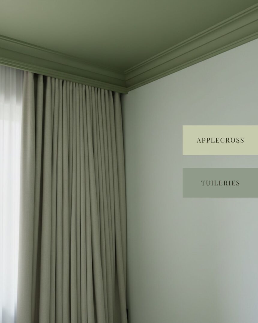
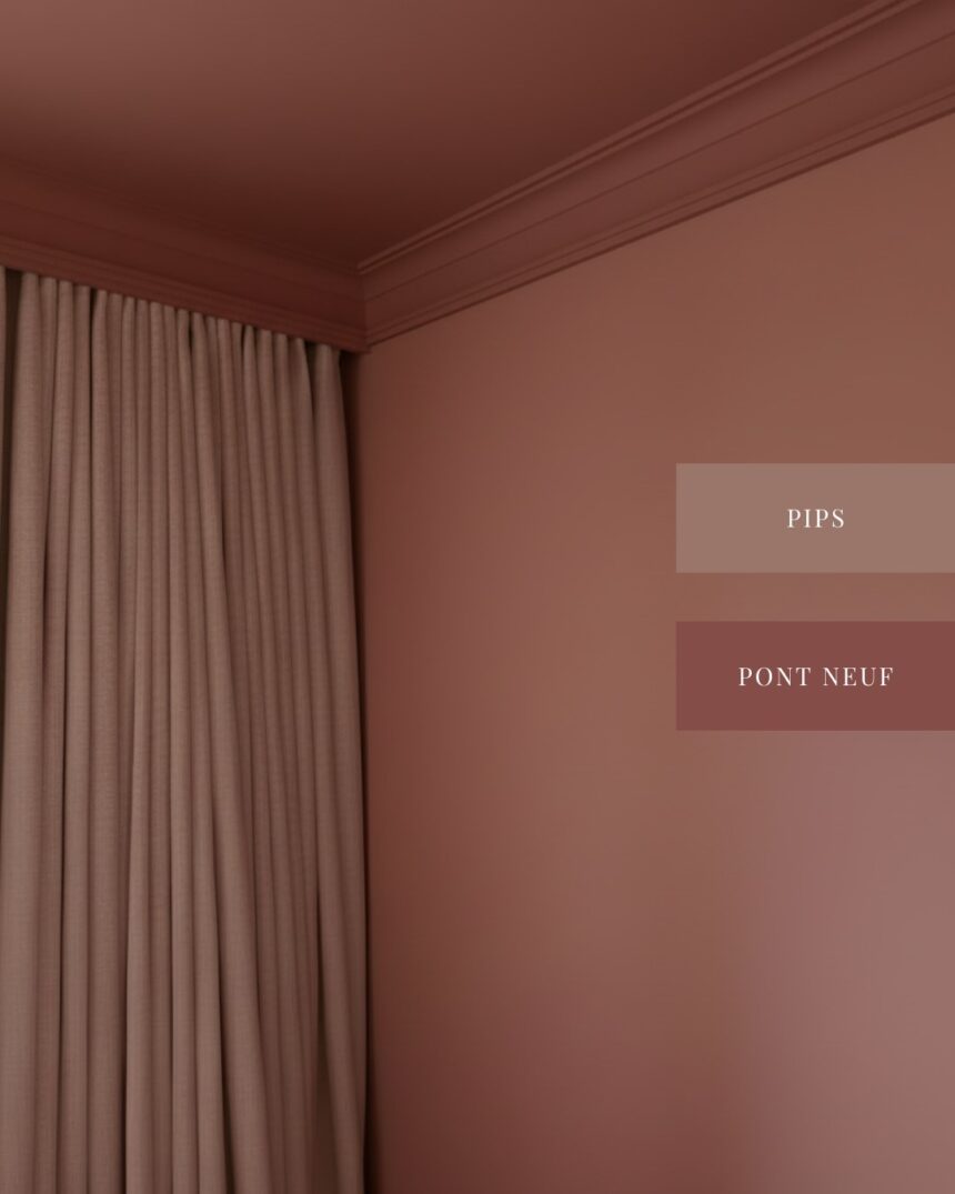
Colour Capping: The Sophisticated Alternative
If colour drenching feels like too much, colour capping offers a refined alternative. This technique uses a tonal wash that graduates up to the ceiling – imagine the lightest shade anchoring your walls, a mid-tone framing moulding, and the deepest hue "capping" the ceiling.
The result is soothing, cohesive, and subtle. A soft hue for walls moving into a mid-tone for cornicing, topped by a warm terracotta ceiling creates instantly pulled-together, cocooning spaces.
Ruffles, Texture & Movement: Softness Returns
After years of sleek minimalism, there's a return to softness and tactile experiences. Ruffles, gathered fabrics, fringing, and tufted furniture are adding warmth and personality to spaces.
James notes: "I'm finally getting my ruffle moment. Projects are letting me really have fun with fabrics, texture and movement."
We're moving away from bare windows and stark furniture, embracing fabric as a focal element that adds warmth and invites you to actually live in the space.
Warm Earthy Tones: Grounding Our Homes
Throughout 2025 and into 2026, warm, earthy tones – terracottas, soft browns, clay shades, and warm beiges – are grounding spaces and creating sanctuaries. There's something deeply reassuring about these colours.
People want their homes to feel like safe, nurturing spaces. Earthy tones deliver exactly that. Psychologically, warm colours are associated with comfort, joy, and vitality – making spaces feel inviting and cosy, especially important in Irish homes where we spend considerable time indoors during darker months.
Our warmer neutrals and terracotta shades reflect this continued demand. These aren't bright, attention-grabbing colours – they're subtle, sophisticated tones that create calm backdrops while still feeling warm and characterful.
What We're Leaving Behind in 2026
James was clear: "Cold, uninviting interiors. I think 2026 is all about warmth, personality and character."
The era of stark, impersonal, overly minimalist spaces feels like it's finally ending. What's replacing it is far more interesting: spaces that feel warm, layered, personal, and genuinely livable.
We're moving away from:
- Harsh, cool whites that feel stark in Irish light
- Overly perfect, staged-looking interiors
- Following trends blindly without personal preference
- Cold, grey-heavy palettes lacking warmth
Our Final Thoughts: Paint That Works for Irish Homes
At Farrelly & Co, we've always believed beautiful spaces start with colours designed for the light you actually live in. That's why every shade in our Premium Collection was developed specifically for Irish homes and Irish light.
The trends we're seeing – dirty neutrals, warm earthy tones, thoughtful colour techniques – all align with what we've advocated since starting: choose colours that feel right for your space, your light, and most importantly, for you.
Whether you're drawn to the sophistication of dirty neutrals, the drama of colour drenching, or the grounding warmth of earthy terracottas, choose colours that make you feel something. Colours that make you want to spend time in your space.
Use our peel and stick samples to see how shades behave in your specific light throughout the day. Live with colours for a bit. Notice how they make you feel. And if a colour makes you nervous, that's often a good sign – it means you're pushing beyond safe choices and creating something truly personal.
The beauty of paint is that it's not permanent. If you don't love it, you can always repaint.
Ready to Transform Your Space?
If you're feeling inspired and ready to start your colour journey, we're here to help. Explore our Premium Collection, order samples, or book a colour consultation with one of our partnered designers.
Because the best trend is always the one that makes you happy every time you walk through your door.
About the Experts:
James McNamara – JMC Studios | Interior designer specialising in architectural details, lighting design, and transformative colour use.
Tammy Lane – Lane Interiors | Colour consultant and interior designer known for grounding spaces with earthy colours and thoughtful colour trimming techniques.
Farrelly & Co – Premium paint brand creating Zero VOC, vegan paint designed specifically for Irish homes and Irish light. Offering colour consultations, premium paint collections, and sustainable interior solutions.
