

 Whites
 Neutrals
 Browns
 Blues
 Greens
 Greys
 Pinks/Purples
 Oranges
 All Colours



Should Your Ceiling Really Be White?
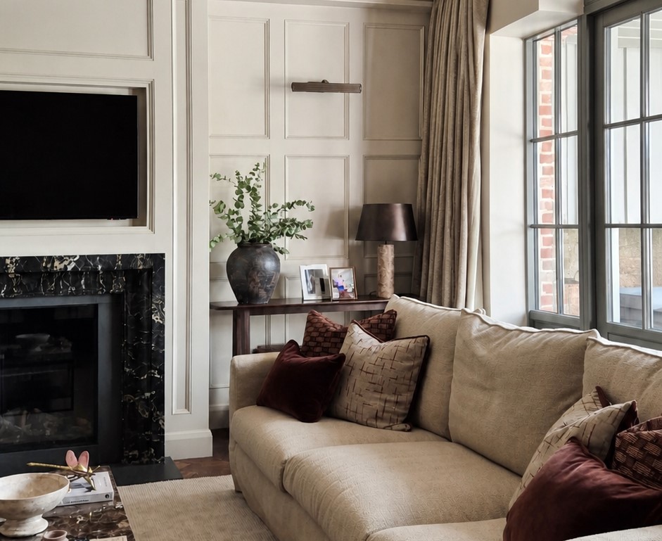
Most of us choose a wall colour carefully and leave the ceiling white without discussing it. White is familiar, practical and often exactly right. It is not, however, the only choice.
The ceiling is a large surface. Its colour affects the contrast in the room, where the eye stops and how clearly the edges of the space are defined. A bright white ceiling beside coloured walls creates a crisp boundary. Sometimes that looks fresh. In another room, it can feel disconnected.
When white works
A white or very pale ceiling is a sensible choice where you want a clean contrast with the walls. It can also connect with white woodwork and other pale details across the room.
Bán is one Farrelly & Co option to consider when a light ceiling is right for the scheme. Ernest sits between white and pale grey, with a cooler quality that can bring a contemporary note to a period room.
The important part is how the ceiling white relates to the wall colour. A very cool white beside a warm wall can appear stark. A softer white or pale neutral may create a gentler transition.
Consider a related neutral
The ceiling does not have to match the walls, but it can belong to the same family. Using a related pale neutral reduces contrast and helps the surfaces feel connected.
Dapper is a stony off-white with soft light-grey undertones. It could be considered where a brilliant white feels too sharp but a full-colour ceiling would be too much.
This approach can be especially useful in rooms with cornicing. The ceiling, cornice and wall colour can be treated as three separate elements, or brought together through closely related tones. The right answer depends on which details you want to notice.
Taking wall colour overhead
Painting the ceiling in the same colour as the walls removes the strong horizontal line around the top of the room. It can make an awkward ceiling shape feel more coherent and create a more settled atmosphere.
This does not only work with pale colours. A small sitting room, reading room or bedroom can take a deeper colour across the walls and ceiling, particularly when the aim is to work with the room’s enclosed character rather than fight it.
Quinta is a soft muted grey with brown undertones, while Nin is a mid grey with a touch of magenta that can appear almost lilac in cooler light. Either could create a subtle all-over scheme, depending on the natural light and existing materials.
With a much deeper colour such as 22:22, which is a strong blue with green undertones, the result would be more defined and atmospheric. That needs to be judged in the actual room rather than from a small image.
Using the ceiling as a feature
There is another option: keep the walls quieter and use a stronger colour overhead. This can draw attention to ceiling details or make a tall room feel more intimate. It is a considered choice rather than a shortcut, and the colour needs to connect with something else in the room.
Possible connections include artwork, a rug, upholstery or a detail in patterned fabric. Without that relationship, the ceiling can feel separate from the rest of the scheme.
In a period property, decorative cornices and ceiling roses also need thought. Painting everything in one colour can emphasise form through shadow. Using contrasting colours makes individual details more noticeable. Neither is automatically better.
Choose the finish carefully
Farrelly & Co Pure Matt has a flat finish and is suitable for interior walls and ceilings. A flat finish generally keeps the focus on the colour rather than reflected sheen, but the condition and use of the room still matter.
Ceilings need the same basic preparation as walls. Cracks, stains, loose paint and uneven repairs become more obvious once a fresh coat goes on. In older homes, the junction between the ceiling and cornice may also need attention before painting begins.
Test it overhead
A sample held vertically does not tell you exactly how the colour will look on the ceiling. Ceilings receive light differently and can sit in more shadow than the walls.
Move a Peel & Stick sample onto the ceiling, or hold it flat overhead, and check it at different times. Look at how it relates to the walls, woodwork and floor. Check it again with the room’s usual lamps switched on.
White may still be the best answer. The difference is that it will be a decision, not simply the default.
For support choosing colours across walls, ceilings and woodwork, book a Farrelly & Co Interior Colour Consultation.